Bungled Uniforms
September 23,
2009 | Kevin
Zdancewicz
For
this generation, the
Cincinnati Bengals have been perennial losers. We're talking two
winning
seasons in the past twenty years (1990 and 2005). Clicking through
the Bengals
History
page is like
a marathon of all those depressing summer reading books in high school.
(It's interesting
to me that such a disheartening franchise has such a comprehensive
history
page, but that is neither here nor there). It looked like the Bungles
might
turn the corner in the middle of this decade with some .500 seasons
surrounding
that magical 2005 run to the first round of the playoffs that was
stopped short
by a Kimo von Oelhoffen shot to Carson Palmer's knee, but it didn’t
last and
now the team appears to have fallen on hard times again.
A
beleaguered, yet glass-half-full
Bengals fan during this sad stretch could always say, "At least the
team
has cool uniforms." That is, until 2004 when Cincinnati unveiled a new set that left something to be desired. The pre-2004
uniforms
featured a solid incorporation of the tiger stripes theme into the
football
uniform template without going overboard. That basic look had been in use since 1981 when the
team
introduced the innovative helmet design, with the small addition of the
cool
leaping-Bengal logo to the sleeves in 1997. The team didn't do anything
too
drastic to change the look in’04, adding an orange alternate jersey and
black
pants and making small changes here and there. This begs the question,
why
bother ditching the solid previous
set
if the minimal changes are not for the better?
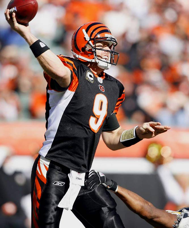
The
current uniforms really don’t
look too bad from the front, but from the side is a whole other issue. Cincinnati
caught
the side
panel bug that has been going around mostly the college game (and some
NFL
teams) in recent years and unfortunately ended up on the miss side of a
hit-or-miss uniform element. When the new Bengals’ uniforms were
unveiled, I
remember hearing that the white side panels were meant to mimic the
white on an actual Bengal tiger. Though potentially
apocryphal, if that
was part of the reasoning then the Bengals organization seemed to
forget an
important fact: they were designing football uniforms, not an actual
animal. The
white looks fine on a tiger, but not so much on these side panels.
Cincy tried
to integrate the white into the pants stripe – not a bad idea considering that a
large
patch of white might not sync up nicely with the tiger stripes pattern
– but the
final product is less than stellar. This error is only compounded by
how far
the panels come up on the jerseys, which is often inconsistent from one player to the next.
The helmets remain the one bright spot, an orange
shell with
distinct black tiger stripes that surely cover the most polycarbonate
real
estate in the NFL. The simple, but powerful look strays from the normal
pattern
of a team logo on each side or wings/horns that appear to come off a
player's
head and becomes something very unique. But unlike a description of the
rest of
the uniform, in this case we mean unique in the good way.
Photo Courtesy of SI.com
Jersey of the Week Archive
|