The Future in 1999
March 24, 2008
| Kevin
Zdancewicz
There have been a ton of things throughout history
that make
you say “There’s no way that actually happened.” Within the sports
uniform
realm there are a bunch as well, and one of the most memorable
(especially
since it occurred within the last decade) was Major League Baseball’s
use of
“futuristic” jerseys during the 1999 season.
Here are the Cliff Notes on the event: In
1998,
the Seattle Mariners
came up with an idea for a one-game promotion based on the throwback
uniform
games that had become a staple in the MLB. The catch is that instead of
old-school jerseys, the teams would wear “future” jerseys, ones meant
to predict
what teams would look like in thirty years. (For more information on
and
pictures of the first game, check out this post
from the
excellent Uni
Watch blog that I highly recommend if you are interested in sports
uniforms). The
next year, Major League Baseball created a league-wide “Turn Ahead the
Clock” promotion
based on the idea, featuring 22 participating teams and a full schedule
of games.
Pictures of TATC uniforms in
action are
almost impossible to
find on the internet (I think I found less than ten). There is,
however, a
great site that documents many of the future jerseys themselves. As
you can see,
they were
a little bit off-the-wall and anything but conservative. Some teams
rocked giant
versions of their logos or script names, while others made their looks especially
futuristic.
Many participating franchises even tried a new look for the back of the
jersey,
and as a result of all of these factors, the promotion was a received
rather poorly
(check out this YouTube
clip on the event).
With that said, I thought the
Turn
Ahead the Clock promotion
were kind of cool, especially since it was truly a one-season idea that
has not
been attempted again since. There were definitely some ridiculous
jerseys, but
there were also some decent ones (bearing in mind the nature of the
promotion) such
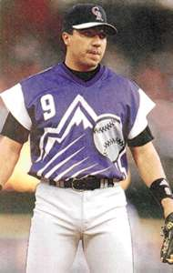
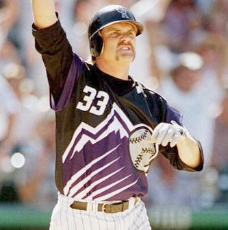
as the Colorado Rockies jerseys featured above. They went with the
“let’s blow
up our logo and throw it on the jersey” look which worked well since
the
mountains look pretty sweet rising up from the bottom of the shirt. The
Rockies
played two TATC games and thus had two different looks – one purple
with white
and the other black with purple (the better of the two in my opinion).
While we’re on the topic, I want to mention
a
couple of other
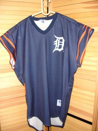
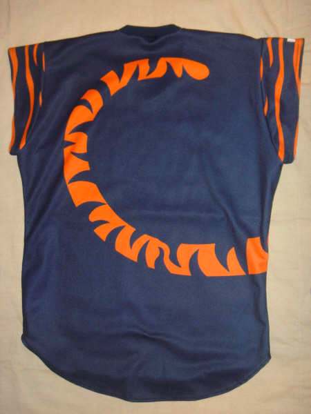
jerseys (pictured below) that were especially interesting. The Detroit
Tigers
jersey was never worn because their second Turn Ahead the Clock game
was rained
out. Keeping in mind the tiny sleeves component of the “future”
template, I
thought the tiger stripes were a great touch – reminiscent of the Cincinnati Bengals on the gridiron. Despite the
madness of the tail on the
back
(imagine those with names and numbers), the Tigers did reserve some
tradition
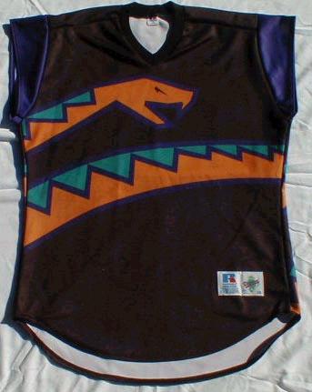
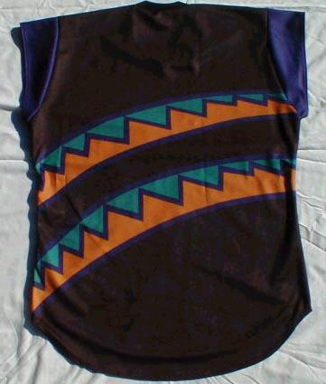
with the fronts of their jerseys. The Diamondbacks did no such thing,
refusing
to reserve any portion of their jerseys for a familiar format, instead
wrapping
a snake all the way around the body as though it was trying to
suffocate its
prey. Unfortunately, there appear to be no photos of the D-Backs jersey
with
player names and numbers, something I would love to see even though
most people
would just as soon forget this event ever happened.
(Update:
In a later
column
about the Arizona Diamondbacks, I featured some pictures of the
D-Backs’ 1999
Turn Ahead the Clock jersey which solve the mystery of what Arizona’s wrap-around
snake uniforms would look like with names and numbers.
Pretty crazy right? Now, if we could just figure out what was on the
hats…)
Note: Photos of those Rockies and Tigers jerseys
come
courtesy of Bill Henderson, who produces an amazing CD that catalogues
essentially every Major League jersey since 1970. I greatly appreciate
the help
Bill gave me in producing this article and hope that you will check out
his
site: www.mlbstyleguides.com
Jersey of the Week
Archive
|