The Stars and Stripes on Ice
February 11,
2010
| Kevin
Zdancewicz
I watched the Super Bowl at a friend’s
apartment on Sunday
and during one of the commercial breaks (which were actually worth
watching for
the first time in recent years) his roommate mentioned the Olympics.
When I told
him I was excited for them, he said, “For what sport?” Without
hesitation, I
replied, “Hockey.”
I love international sports competitions
like the Olympics
and the World Cup because of the intense patriotism it brings out of
the
players and fans. The Olympics persuade me to watch sports I otherwise
wouldn’t
check out, so when they include sports that I actually do watch during
the two
years or so between Games, I catch that Olympic fever even more. Hockey
is one
such sport. My Olympic hockey fixation dates back to 2002 when I ended
up
watching a couple full days of games, one after the other regardless of
the
countries involved. I’m a sitting duck for this type of setup, like a
television channel that doesn’t put commercials between the end of one
show and
the beginning of another so that you get sucked into watching something
you
weren’t originally planning to. Throw in the fact that 2002 saw the
United
States take home silver, marking the first US hockey medal since the
Miracle on
Ice and I was hooked. The 2006 Games didn’t go as well for the
Americans, but I
was as invested as I was four years before and now in 2010 I’m ready to
go.
This might be obvious from my column
archive, but I am also
excited to see the jerseys that the countries will be wearing in the
Olympic
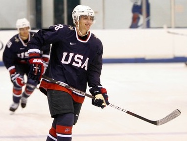
tournament. You can check out all of them here. As you can see, the United States will
have
three
jerseys: white,
navy, and retro-style white. Speaking as objectively as I can, I
think Team
USA is going to be one of the best-dressed teams in the field. Canada
and
Sweden are definitely on the medal stand with them, but the rest of the
jerseys
are too busy and “modernized” without adding anything to the uniform in
my
opinion. The United States went the opposite direction, scaling back
the
striping and extra embellishments. Whereas I could go on all day
nitpicking
some of the other teams’ sweaters, there’s really only a couple
drawbacks for
the Americans. For one, the sleeve stripes don’t wrap all the way around on either jersey which is an unfortunate trend in
the
NHL
right now. The navy jerseys feature an ugly star on the shoulder as well as watermarked
tribal
graphics on the sleeves and back (more on that later). The retro is a
nice
touch, but it’s inexcusable to wear it with navy pants. Otherwise, the set is very solid.
In my column about the US’s World Baseball
Classic jerseys
last year, I mentioned how the battle for best USA wordmark was a
toss-up
between the baseball and hockey. That was originally one of
my
other
gripes with these uniforms: the lack of the usual USA Hockey logo on the front of the jersey. I
also
included
a link in that column to this jersey from the 2008 World Championship
which, along
with the accompanying white (on the right), is probably
my
favorite
Team USA jersey. It turns out that I can’t blame USA Hockey for the
crest’s
absence in the Olympics as the team couldn’t use that logo anymore
because of
an IOC rule about not putting official team logos on the jersey (this
was a
huge deal for hockey-crazed Canada whose maple leaf logo had to be
altered for
the Games). The decision to go with a conservative, yet classic “USA”
is a
solid compromise given the circumstances.
Now about those watermark graphics. You
probably didn’t
notice them because they only appear on the lower back and sleeves of the jersey, but they are there. Nike
seems to be
adding this to everything it touches these days and I’m not a fan. One
of its
first appearances was on Team USA Basketball’s jerseys in the 2008
Olympics
and then
with Duke last season. Just last week, Texas, UCONN, and Syracuse all unveiled new jerseys with
the
watermark tribal graphics as well. It appears you have to be pretty
close to
make out the graphics, otherwise it just looks like a huge sweat spot on the back of the jersey. While
the
lingering question remains if spectators can’t see them then what’s the
point of
having them in the first place, I’m just glad that watermark graphics
are not
going to be very visible on the ice during games. All in all, the
classic,
clean look of the States definitely medals in aesthetics for my money.
Hopefully the squad can equal that feat in the actual tournament too so
we can
hear the Star-Spangled Banner to close out the Games.
Photo Courtesy of Icethetics
|